All true, except it’s not really a Whitney clone. It’s Source Sans very lightly adjusted to match Whitney’s metrics. It looks and feels exactly like Source Sans to me. It’s a little strange to present it as a prestigious project with a minisite like this.
Source Sans is nice and easy to read, but so overused it’s rarely a good starting point for a visual identity.
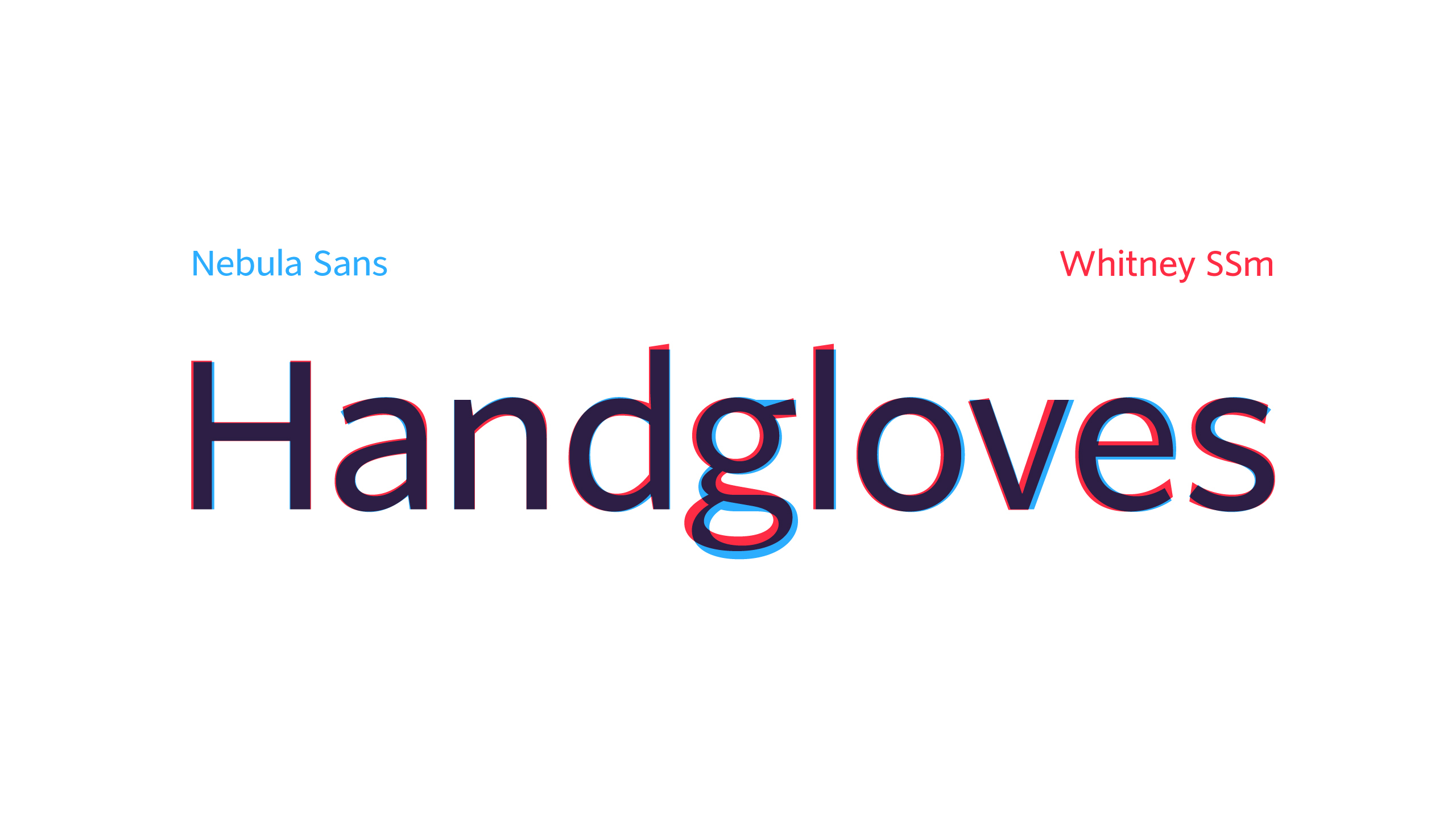
It's more about overall look and feel, which in large part comes from the glyph proportions (the x-height), spacing and weights - https://i.imgur.com/mygqn3H.png
Glyph proportions between Whitney and Nebula are almost identical. As are their weights. Source Sans is substantially heavier and more dense looking.
While individual glyphs may be closer between Nebula and Source Sans, but the overall feel of Nebula is that of Whitney.
Source Sans is nice and easy to read, but so overused it’s rarely a good starting point for a visual identity.